
Designing a business card that reflected my style of work was both fun and challenging. My first choice was to lift a scene from the storyboard I had made to support my project, where the Scientist Sophie frees Beef the Dodo from his cage using a humble pair of scissors. This image is really cute on it's own;

However, as you can see it proved quite difficult to add text on it that looked right. The card has a lot of textures and tones going on that make adding a quirky font that's also easy to read quite a hard task. However, I pushed on. Using the texture from the drawing's background, I made the back of the card with my contact information, which you can see worked better.


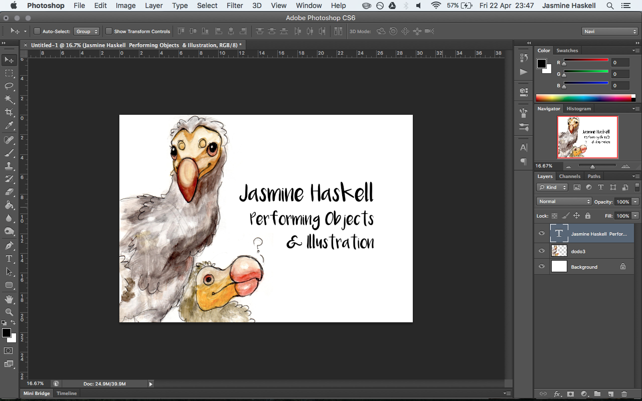
However, overall this business card didn't feel quite 'there'. I wanted to simplify the design, and make the emphasis as much on the text as it is on the image. I decided to start simple, reeling back the background colour to clean white and putting in a section of a page of designs I'd done of Dodos whilst figuring out how I wanted 'Beef' to look. Whilst my initial feeling that scaling it back this much would somehow look uncreative, instead it really put the illustrations in the limelight. By using drawings of my project on my business card and linking to my website where the viewer can see photos of the project I've drawn, there is a very clear and smooth transition between a physical piece of paper and a website on a screen. The next step was to toy around with text and placement.

The image above isn't 'fun' enough. There is too much writing on the card which is detracting from the illustrations and sucking all the fun out of them. The image below is better with a more playful font, but it still doesn't look right to have the email and website addresses on this side.

You can see above that the card looks much cleaner with just the name and job title. The font above is almost there, but not quite the right thing. The font below, however, is much too elaborate for the slightly naive and playful style of illustration. Whilst it's not boring by any means, it clashes with the drawings; this isn't what I want.

The font 'Moon Flower' looks just right. It seems handwritten but is still tidy and legible from a distance, which is what is needed when the cards are only the size of a credit card. The text is to-the-point and concise whilst still feeling handmade and playful. After getting the initial impact of the front of the card right, making the back of the card came together quickly as I knew exactly what information I needed to put on it. It looked a little plain without any drawings on it so I took another, simpler illustration from my sheet of Dodo drawings to compliment the text. I'm really happy with how this card has come out and in person they feel smooth and high quality.


I was lucky enough to find a very useful web developer through a friend of a friend who turned the simple wix website I had created and made a new, similar but much more polished version of it for me. You can see the original wix website I made below, complete with adverts:
http://jasminehaskell.wix.com/jasminehaskell
And my updated, handmade website featuring smooth page transitions and better design. I'm really glad I chose to have the website made professionally, as it allowed me to make the website more individual and I can customise any element of it. The new website is also much faster to load thanks to the hosting I purchased through 123-reg. Uploading the website was a new experience to me but it helped me to gain an understanding of how to keep it updated and using the control panel of the web hosting service.
http://jasminehaskell.co.uk/
The final step of my 'career goods' process was creating a good Creative Curriculum Vitae which fitted in neatly with the design of both my business card and website. I kept the font 'Moon Flower' to create a good sense of continuity between all these pieces. I wanted to make my CV essentially an elaborate business card, with all the details a potential employer would need. By making my CV to-the-point like this, I can open up to the client with further details about my personality, whilst having a starting point to discuss on. Because the CV is also easily legible, it could be printed onto A5 or possibly even A6 flyer to be handed out.

No comments:
Post a Comment